

Scientific & Clear
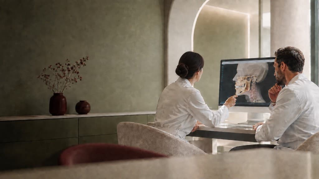
Speaks in accessible terms free of medical jargon, rooted in evidence-based medicine.
SOART / Loading
Shaping the next view…

A scientific, warm and transparent orthodontic brand, from identity to Instagram and an AI-assisted web experience.
Visit WebsiteThe brand idea
Orthodontics does more than align teeth. It transforms expression, confidence and everyday life. For Evin Koç Alakuş, we created a specialist brand that pairs scientific precision with human warmth.
01Scientific and clear
02Elegant and refined
03Empathetic and attentive
04Innovative and transparent


02 / Challenge
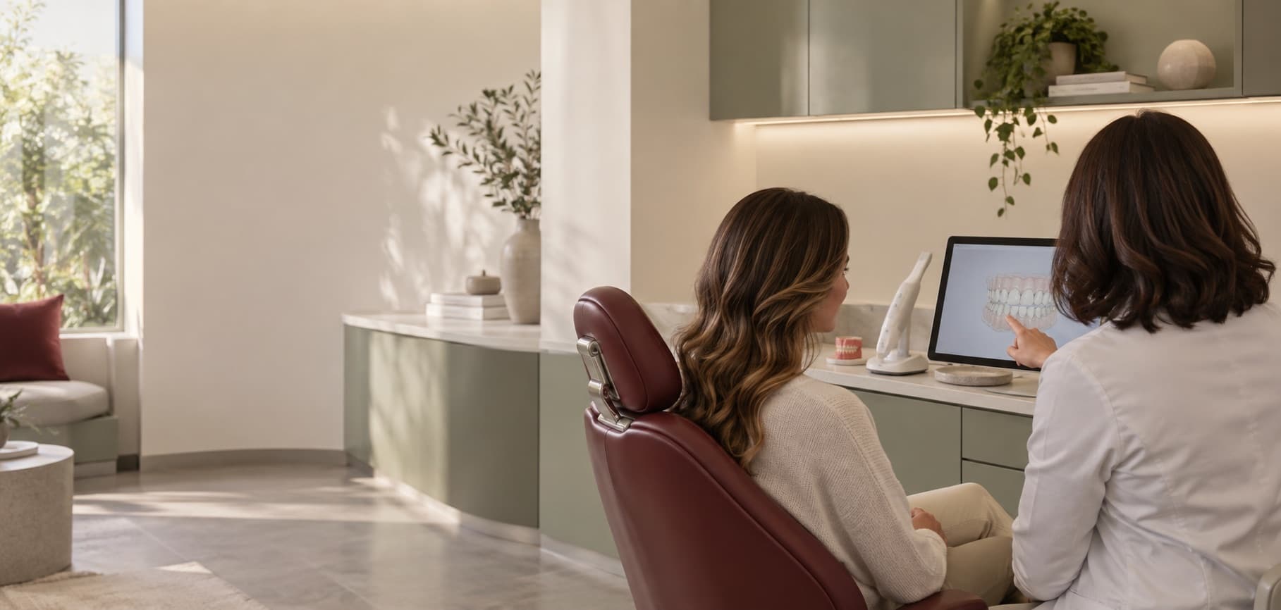
The category spoke through sterile blue-and-white imagery, interchangeable tooth icons and dense medical jargon. Yet orthodontic care is a long, personal and often anxious decision.
Trust had to come not from ratings or promises, but from the consistency of the identity, the clarity of the language and the transparency of the experience.
03 / Identity
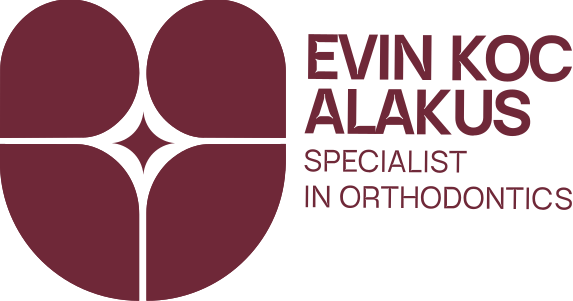
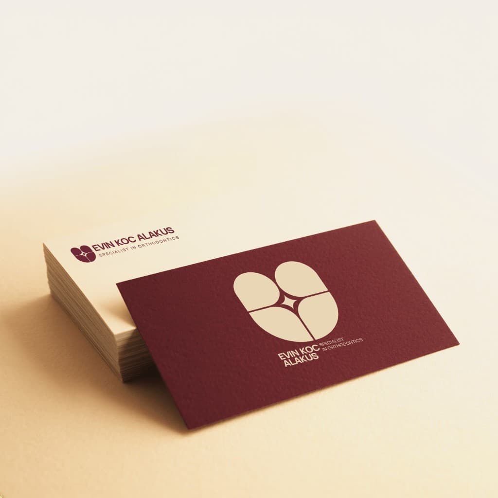
Our logo is born from the union of three core values: Expertise, Aesthetics, and Trust.
While the foundational tooth outline represents our expertise in orthodontics, the sparkle curves at the center symbolize the confidence and radiance of a perfect smile. The two human silhouettes emerging at the top express the doctor-patient dialogue, trust, and empathy at the heart of our treatment approach.
Origin

Core of the mark
The four-pointed sparkle at the centre of every smile: the first sign of confidence and radiance.
Step 1: Tooth outline
Definition of expertise area
The design begins with a stylized, U-shaped basic tooth form representing expertise in the field of orthodontics.
Step 2: Internal pattern

Aesthetics and excellence
Added an internal pattern: the intersection of negative space at the center creates a 4-pointed star, symbolizing the excellence of treatment and an aesthetic, sparkling smile.
Step 3: Dialogue and brand identity

Communication and trust
Silhouette of two people in dialogue, shining light: the curves at the top reveal two human silhouettes in dialogue, representing trust, empathy, and communication between doctor and patient.

04 / Visual language
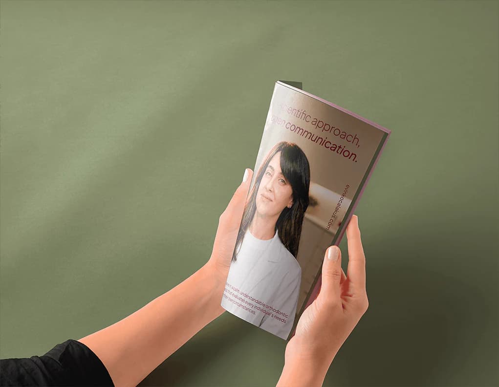
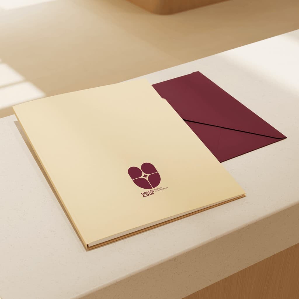
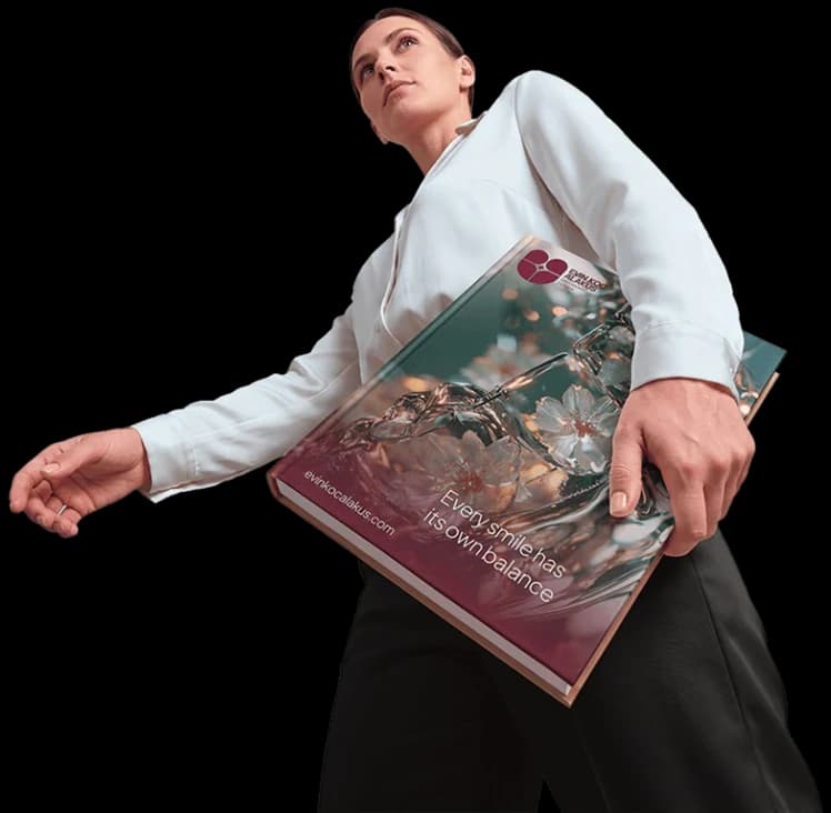
We replaced the category’s expected blue with deep burgundy, paper tones and sage. Crystal dental imagery carries the science; flowers, light and portraiture carry the human side of transformation.
05 / Brand world


06 / Communication Tone
The brand’s voice perfectly mirrors the editorial and refined atmosphere established across all media.
Speaks in accessible terms free of medical jargon, rooted in evidence-based medicine.
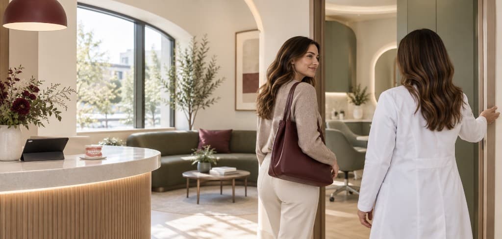
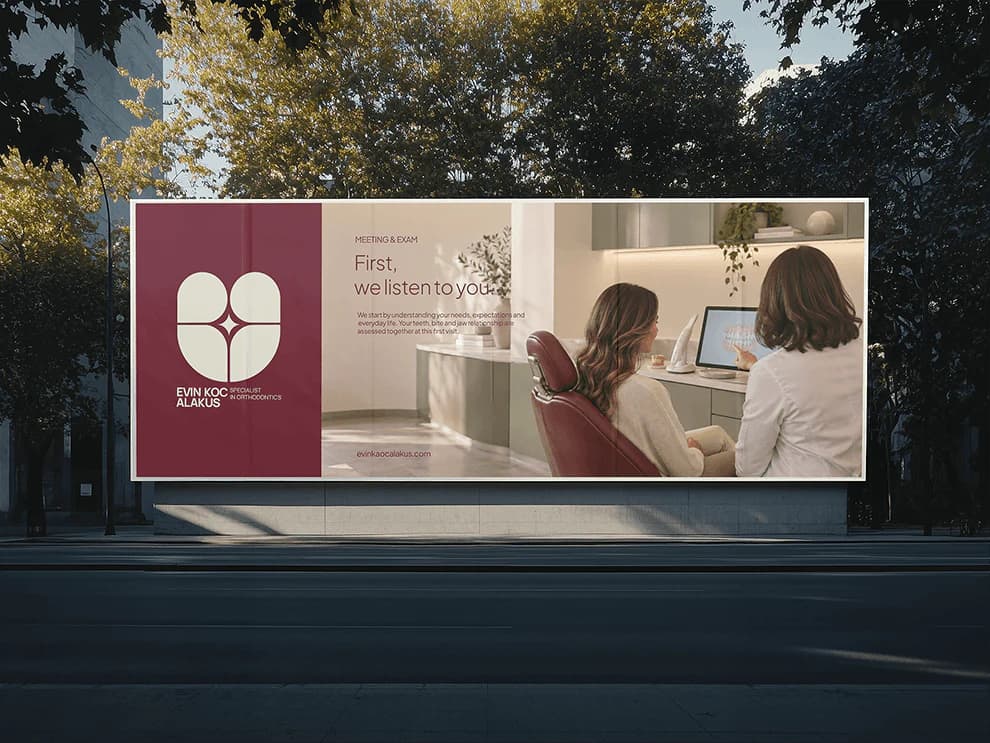
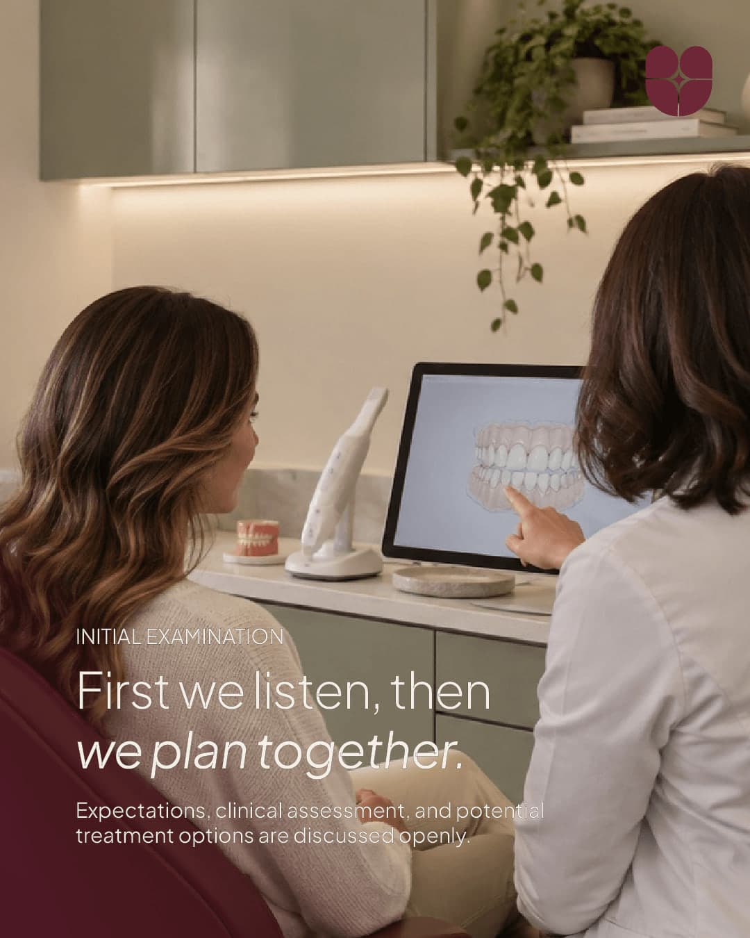
Embraces the principle “First we listen, then we plan together,” fostering collaboration over hierarchy.

Uses a calm, confident and high-aesthetic tone reminiscent of editorial publications.
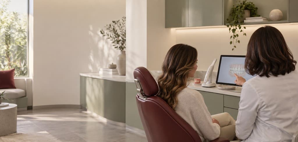
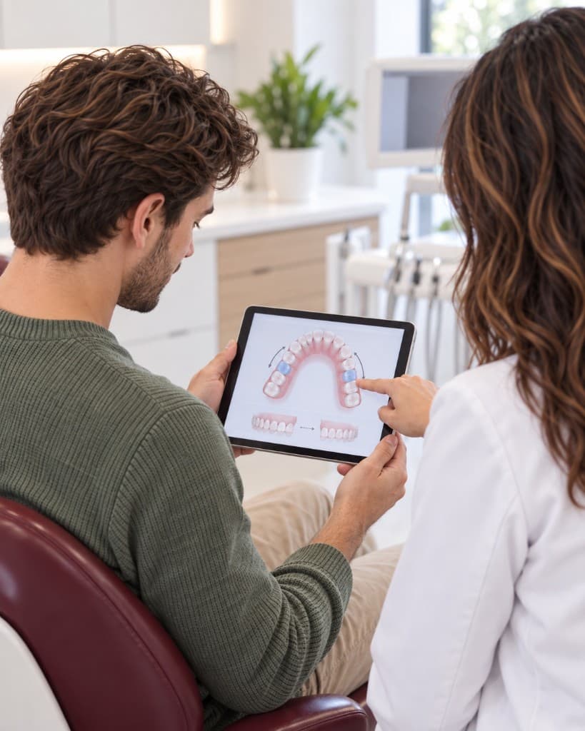
Presents digital simulations and technology with absolute clarity that adds value to the patient.
07 / Brand Imagery
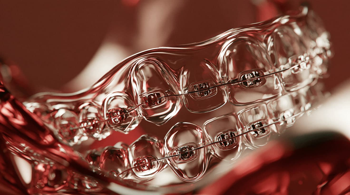
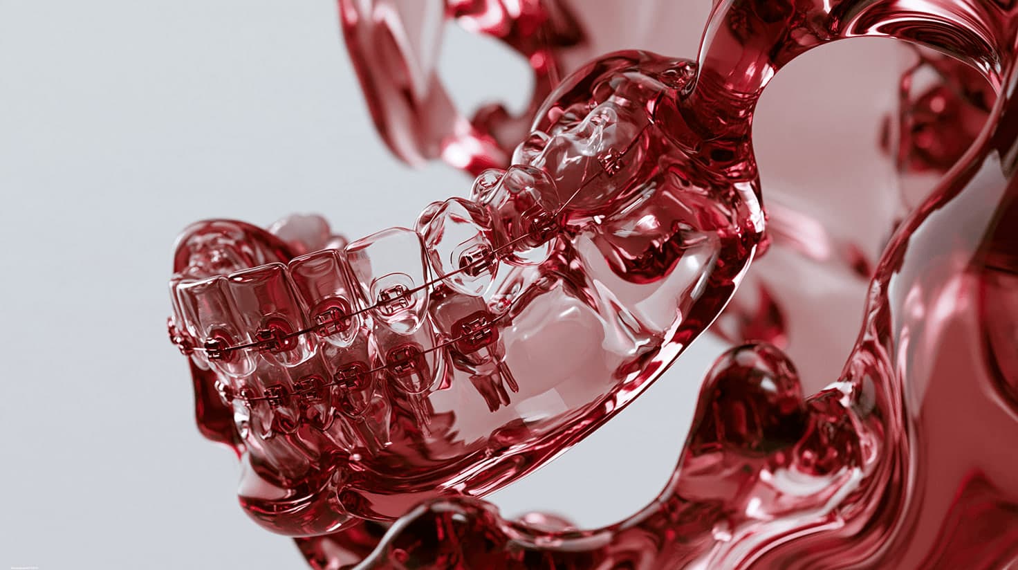
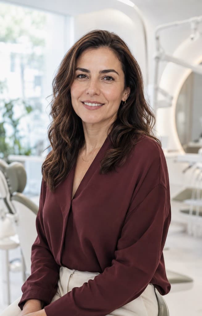
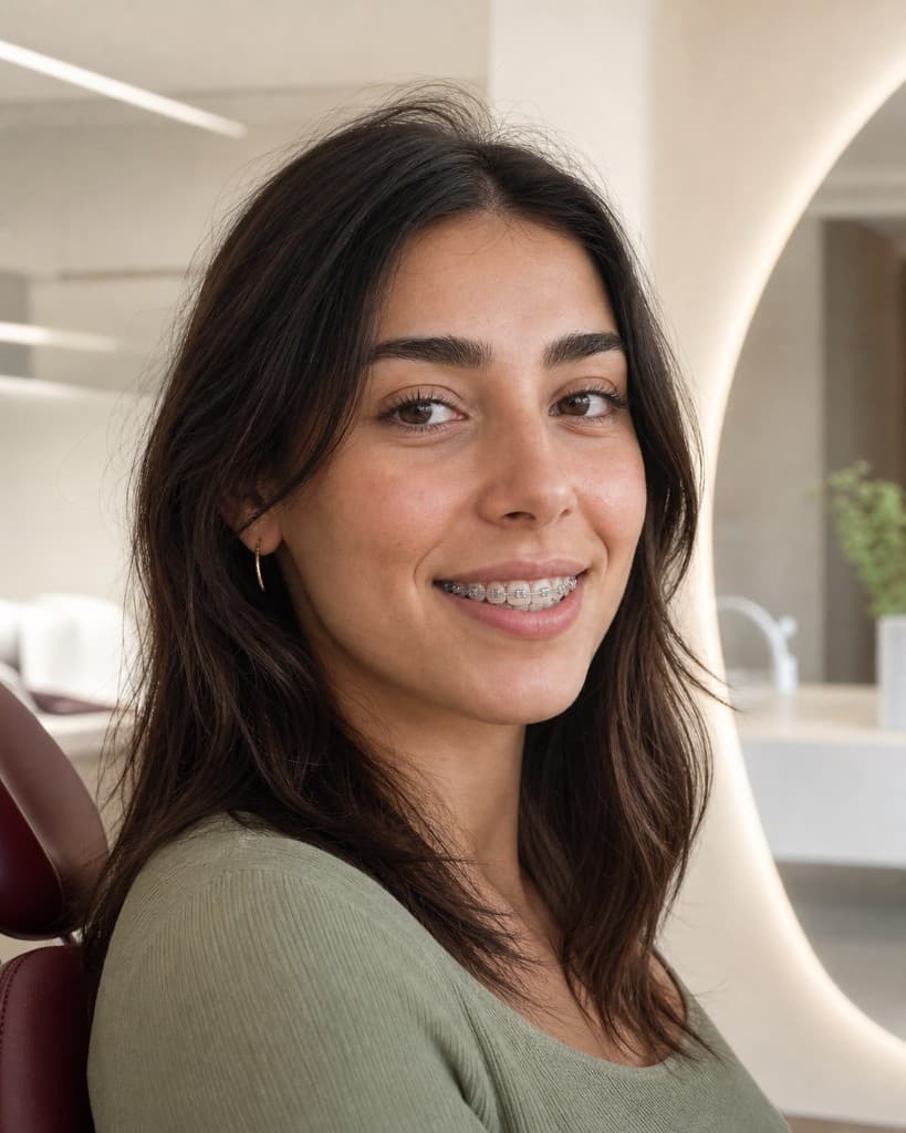
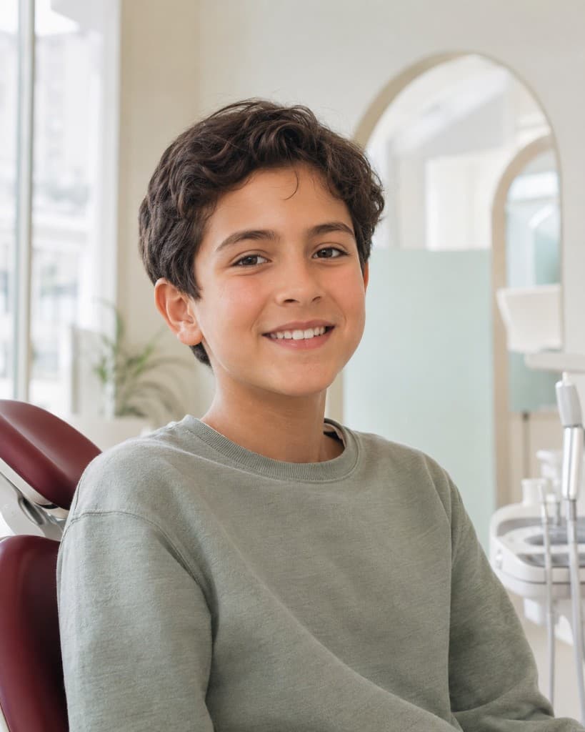
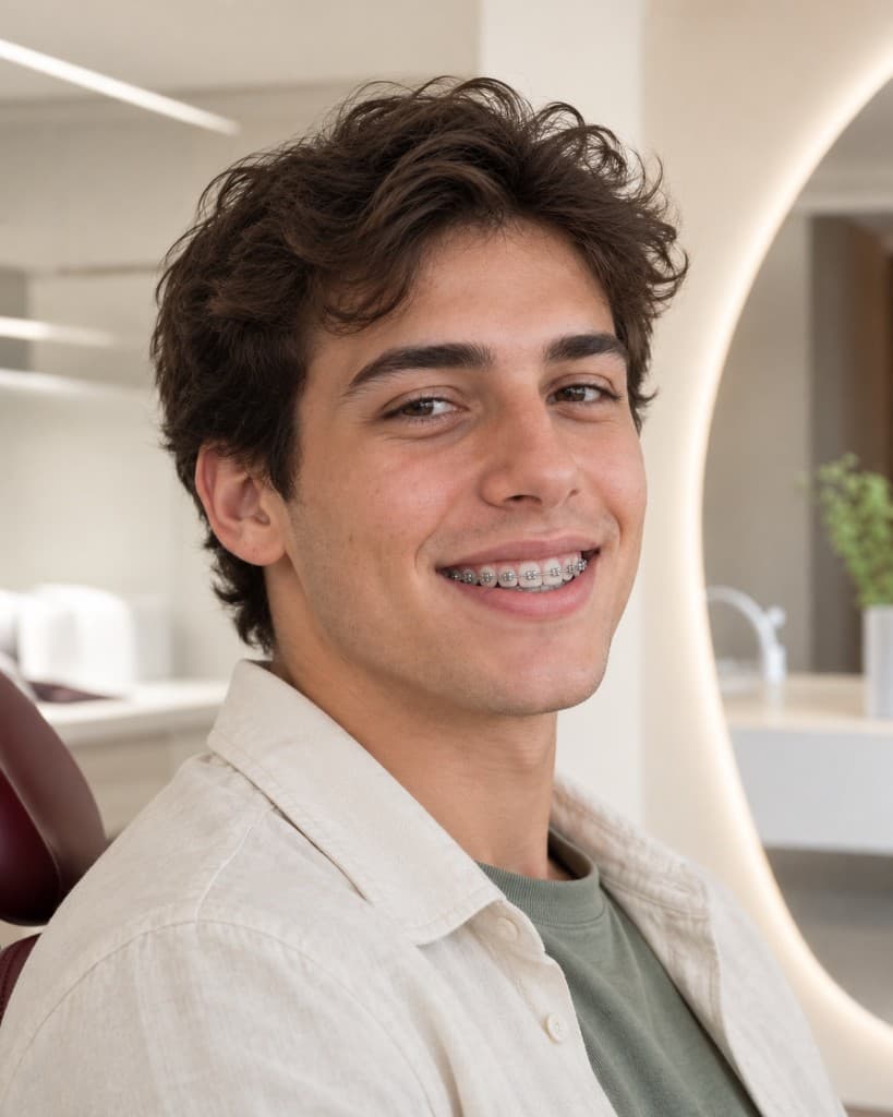
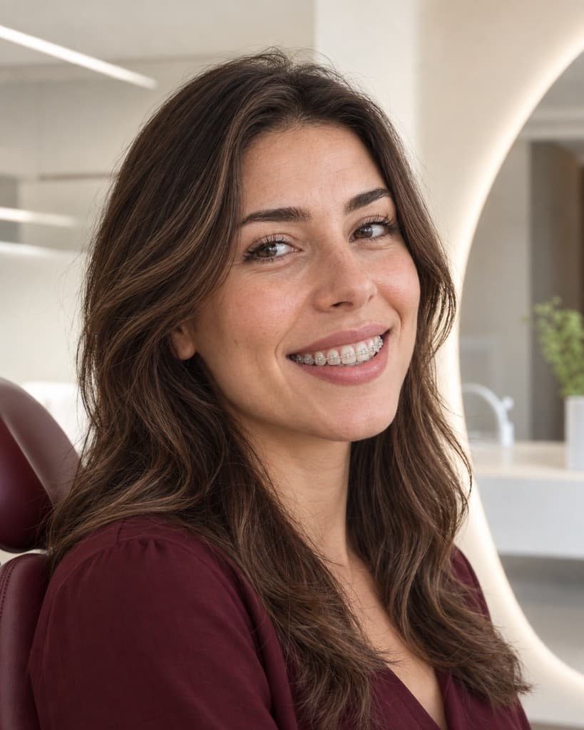
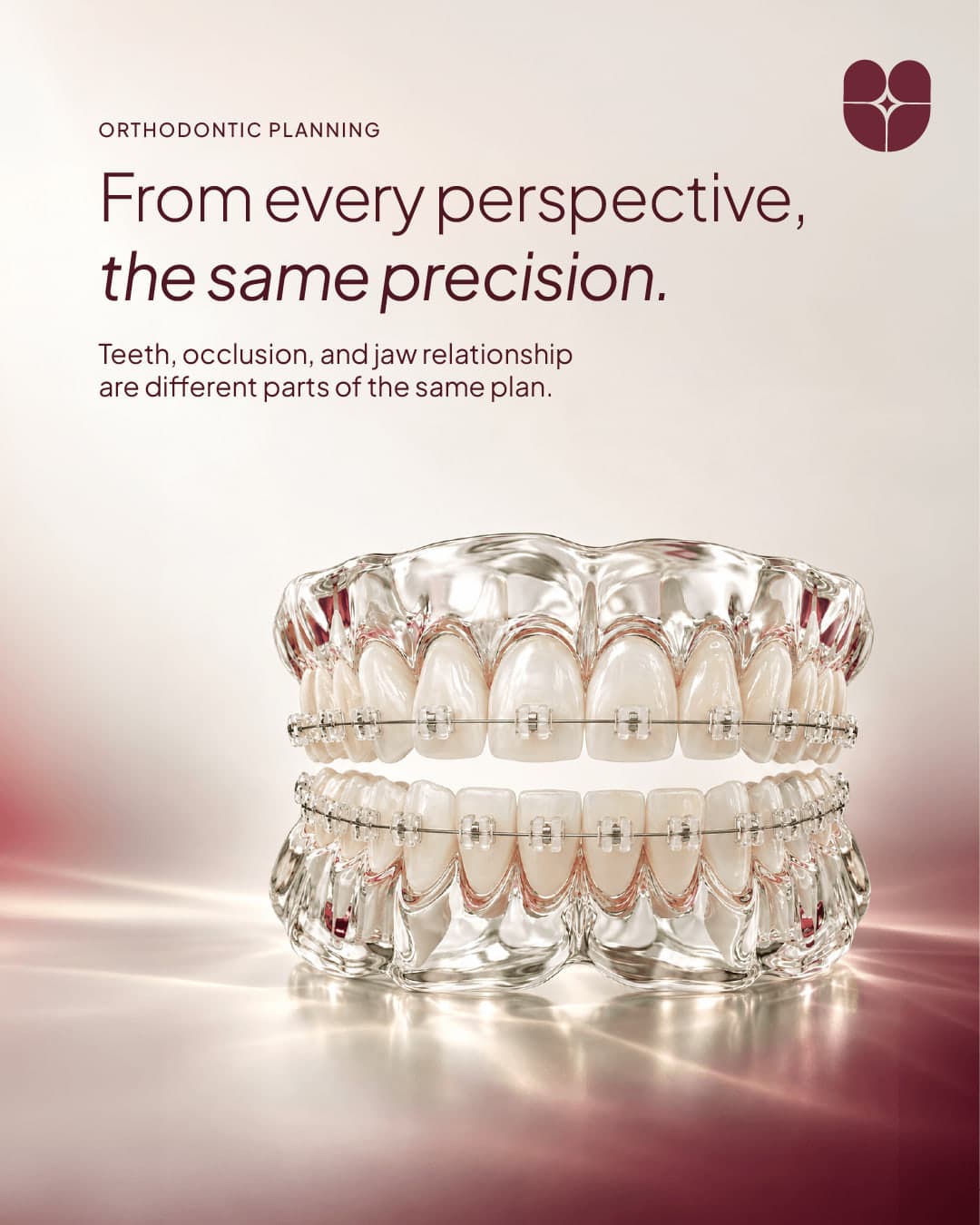
We traded sterile shots for editorial photography, and graphic tooth icons for crystal 3D renders. Crystal dental imagery carries the science; flowers, light and portraiture carry the human side of transformation.


08 / Launch
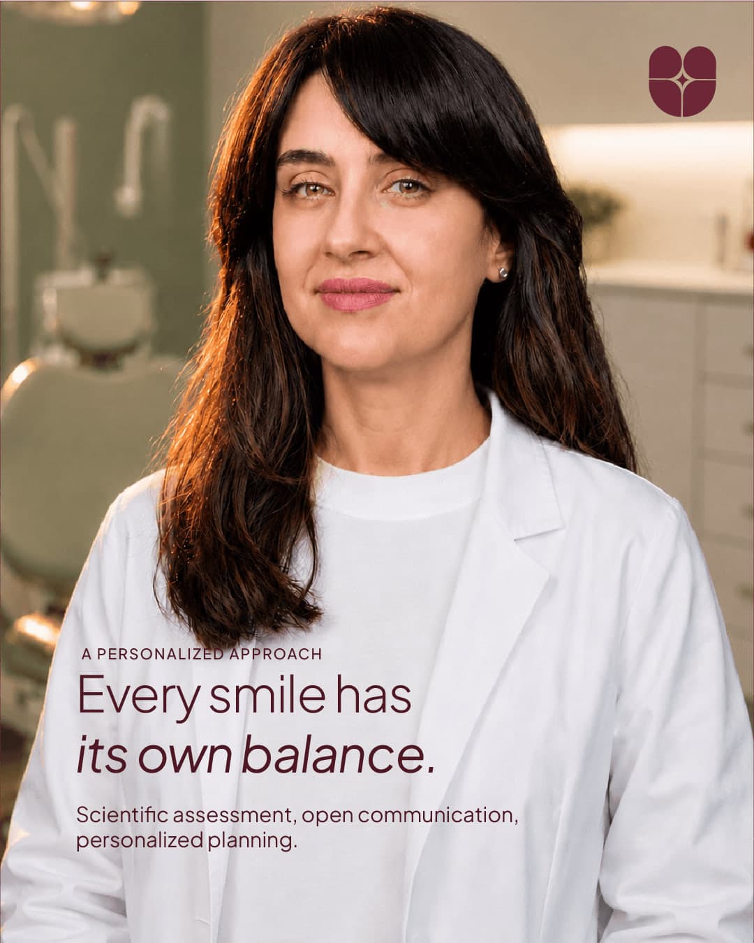
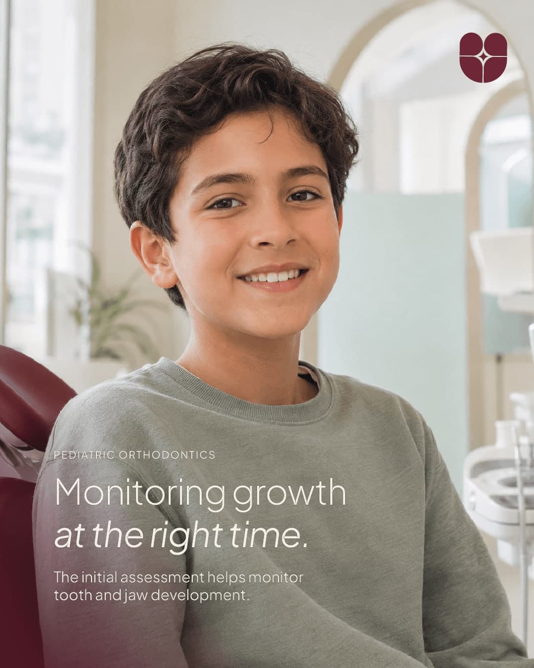
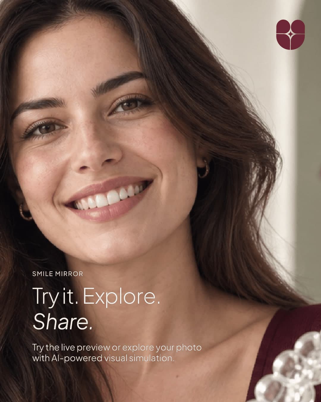
The Instagram launch feed introduced the personal approach, treatment options and clinical journey in one editorial language.

09 / Digital experience
The fifteen-page web experience is built on clear information architecture that reduces uncertainty. An editorial bento layout, calm motion system and treatment-aware WhatsApp journeys make decisions easier.
Built with Three.js, the model makes alignment, bite and jaw balance tangible through mouse or touch.
10 / Inside the site
So visitors can understand their own situation before the first visit, the site moves step by step through a quiz, simulations and guide pages. The recordings below are taken from the live site.
01 — Smile quiz
The quiz asks who it is for, what stands out first in the mirror, how it affects daily life, what matters most, when to start and which clinic suits best. It ends with an assessment suited to age and situation, and a way to send the answers to the doctor.
02 — Smile results
Real treatment results are compared with before-and-after sliders. In 3D simulations of six common conditions, visitors drag through the treatment stages and watch the teeth move to plan.
03 — Treatment pages
All six treatment pages follow one structure: what it is, its advantages, when it applies, how the process runs, the planned movements and frequently asked questions. Visitors know what to expect before they arrive.
11 / Mobile
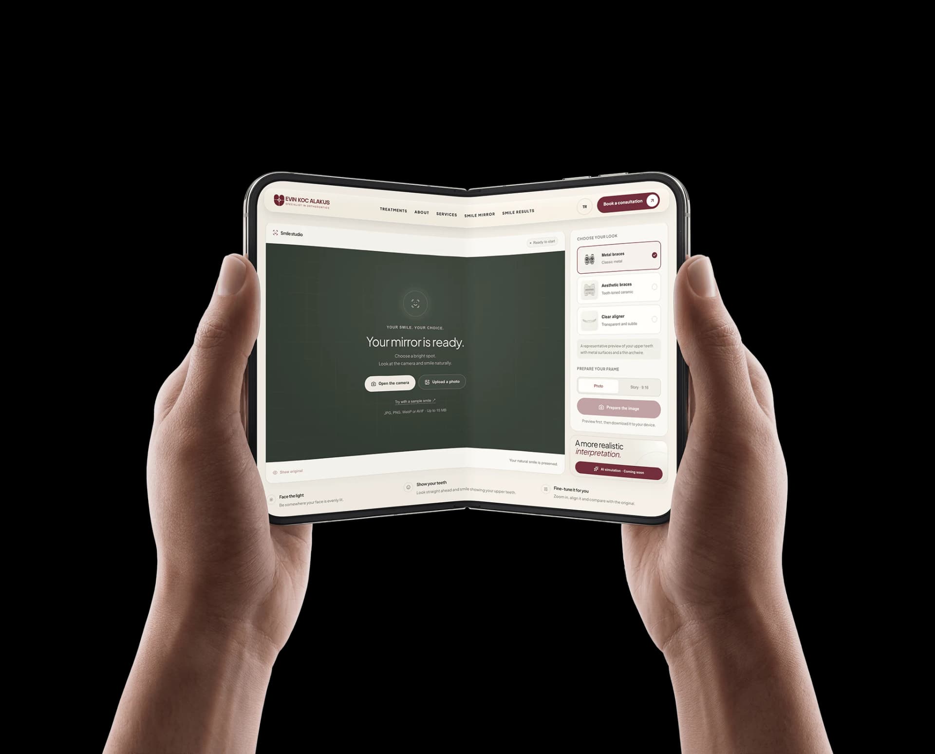
The bento cards flow into a single column on mobile, with the menu and WhatsApp within thumb’s reach. The 3D crystal model turns by touch and the Smile Mirror runs on-device with the phone’s camera.
12 / Intelligent experience
The Smile Mirror lets visitors try metal brackets, aesthetic brackets or clear aligners on their own face. MediaPipe face tracking runs on-device, so the image never leaves the user.
Not to replace clinical judgement, but to help people arrive ready to ask the right question.
13 / Technology
162 MB → 49 MB
Treatments to FAQ
Three.js / WebGL
14 / Outcome
Strategy, identity, a 26-page brand guide, social launch and an AI-assisted digital product come together around one idea: every smile has a balance of its own.
Credits